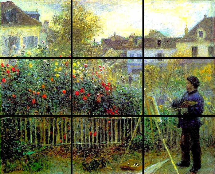
I already explained myself in my last Homer post why I loved this collab so much so I won't repeat myself but I take advantage to thank DioShiba for this fantastic experience that to me lasted four months, making this my longest collab I ever participated. I also want to thank Taytonium for making all of this possible with his daily Homer drawings that inspired DioShiba to continue his legacy.
You two made a unique experience where creativity, inspiration, talent and different skill levels could meet and fuse together. I love seeing everyone's contribution to this collab, I can genuinely feel Homer's essence in each drawing, an explosion of yellowness and fantasy!
I also love the animated Homer put at the left bottom corner of the collage, it's a nice touch that add further creativity and different media that already mixes different media (traditional and digital to be more precise). I would also like to mention how much I love the positioning of each Homer, it's funny and well-thought. For example I've noticed that my thick-billed raven Homer is on top of H.P. Simpson's head as if he perched on purpose on his head. And I remember that Halloween episode that quoted Poe's poem "The Raven" (Bart was the raven there), so I saw a nice, subtle reference to that, plus Poe and Lovecraft are masters of American horror literature.
I find fantastic how Poe’s work influenced Lovecraft in important ways, while at the same time Lovecraft’s fictional, critical, and poetic reception of Poe irrevocably changed how Poe’s work has been understood by subsequent generations of readers and interpreters. This essay talks about it even if you have to download through your school or library in order to fully download it: https://scholarlypublishingcollective.org/psup/edgar-allan-poe/article-abstract/18/2/248/200616/The-Lovecraftian-Poe-Essays-on-Influence-Reception?redirectedFrom=fulltext
I also loved how paired are my Homer on Tankmen' tank and the Homer with NG shirt, it almost looks specular. Another funny interaction I've seen in the composition PLJerry's Homer hiding from Bundelux's zombie Homer XD
Other Homers look at other Homers with curiosity and/or concern. Homers in superheroes costumes put together adds a nice semantic grouping to the composition (heroes with heroes). One of the funniest Homers is the one thanking for the Marge-loaf XD that made me laugh and I find it cute.
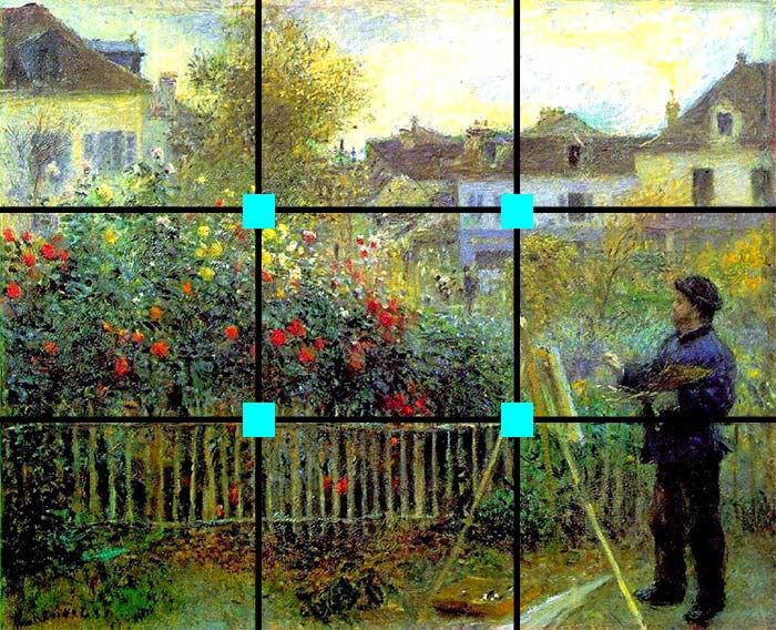
Despite one might think that the composition may look random, it's not because if one pays attention the focal point is slightly at lower position, more specifically Homer Liberty Statue from which rays of different Homers radiates and if you mentally break the composition with the Rules of Thirds you will notice how each square is unique in terms of themes, semantics and Homers. So I commend you for thinking about each Homer!
Again thank you for this collab which I consider my personal best experience in terms of collabs I made during 2024. To me it's the top number one collab of the year in terms of personal experience because I've found a very welcoming environment, talented people, works that inspired me (notable pigeon Homer made by TikkiToon) and I've enjoyed following the forum thread, it's one of the very few forum threads I actively followed (in terms of hitting that heart button I mean). I loved how the collab organizer was always ready to answer everyone's question and very patient with some users that didn't always follow the rules of the collab despite he showed them in a very clear manner.
Thank you to all people who participated to this collab and who made possible this event, the FP is totally deserved and I approve the feature for the Tuesday Takeover.
I hope in future to be able to participate to another collab, DioShiba, if I have time ofc, but in case I am free and you want to make another art collab or a collab that involves also art, I will gladly join. I won't forget this experience for sure, I wish you all a serene Christmas, and serene winter holiday if you don't celebrate it! Thank you, I love you all!


